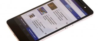
Many people don’t mind purchasing a device with flagship technical characteristics, but at the price of a gadget from the middle price segment. It played quite successfully on this by releasing its model “Honor 2” to the market.
Already on the first day of the announcement, the number of pre-orders for the phone exceeded one million. Besides the excellent price-quality ratio, what else does the Chinese device that has quickly gained popularity hide?
Below is a brief overview focusing on the main disadvantages and advantages of the 2013 model, which is still popular all over the world.
Equipment
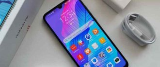
After purchasing a gadget, a person will find in the box a sparse list of accessories and the smartphone itself from Huawei, model “Honor 2”.
Scroll:
- Smartphone "Honor 2";
- The future owner of the gadget can guess about the scarcity of accessories from the small dimensions of the box;
- The packaging contains the characteristics of the device;
- Inside it are: adapter, USB cable, instructions.
It should be noted that the adapter is equipped with a specific plug.
The problem of a non-standard power supply is solved by purchasing an adapter.
If you couldn’t find an adapter, you can charge it using the supplied data cable by connecting it to the USB of your computer.
A capacious 2150 mAh battery is responsible for the good battery life of the gadget.
Appearance of the device
After a quick glance at the design of the brainchild of Huawei under the symbol “u9508” that we analyzed, critics unanimously shouted about the complete lack of individuality in the design solutions of engineers from the Middle Kingdom.
Of course, it’s hard to disagree with them, since the manufacturer placed the main emphasis not on appearance, but on build quality, performance of components and ease of use; the gadget does not evoke aesthetic delight.
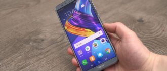
As a result, the appearance of the smartphone does not differ in anything remarkable. A display diagonal size close to five inches, popular among users, is used.
The large screen creates inconvenience when carrying the device in trouser pockets. Men are better off using the chest pockets, but ladies can easily squeeze it into their handbags.
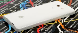
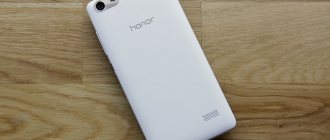
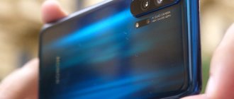
The plastic used does not allow Honor 2 to slip out of your hands. When pressing hard on the back cover, the case creaks, however, no more defects can be detected. The gadget is assembled soundly with minimal gaps.
The front of the gadget is almost completely covered with glass (with the exception of a narrow speaker slot), so the absence of physical buttons does not cause any inconvenience when wiping the screen from marks.
You should immediately pay attention to the advantage of the display, which does not collect fingerprints after touching it, because the manufacturer took care of the oleophobic coating.
The user does not have to frequently wipe the screen. Another advantage of the glass used is its scratch resistance.
The front camera can be seen through the front panel of the product. Next to the front camera there are light and proximity sensors. The presence of an LED notification adds convenience to the use of the gadget. Touch keys are installed under the screen.
The left end is completely devoid of keys; only a micro-USB connector is installed here.
Sound level rocker and On/Off button placed on the right side surface of the device.
At the back there are two loudspeakers and a camera with flash. Below is a microphone.
Headset jack on the top end.
As you can see, the design solutions can be called down-to-earth. They are focused only on the functionality and durability of the device.
⇡#Design
The appearance of the second version of the HONOR MagicWatch smartwatch has been completely redesigned compared to the first. The watch case is still made of high-quality 316L stainless steel, widely used in the jewelry industry and medicine. But the front panel now does not have a metal bezel. Instead, the watch has dark glass that almost completely covers the entire front surface. Along the edge of the glass there is a scale with tachymeter numbers, migrated from the bezel of the first version of the watch. This solution looks fresh and modern, partly because it resembles a regular smartphone with solid glass. The only drawback is that the slightly convex glass of the HONOR MagicWatch 2 is very easy to hit on stones, branches and urban obstacles when playing sports. Whether it will break or not - unfortunately, we did not conduct special tests on this matter.
| Appearance of the HONOR MagicWatch 2 | ||
As mentioned above, the HONOR MagicWatch 2 model is intended for both men and women, although the manufacturer produces a separate version for the fair half of humanity. The watch is quite large, but due to its small thickness, which is slightly less than a centimeter, it does not cling to the sleeves of a shirt or sweater and does not cause discomfort when worn.
| Front panel and rear panel of the case | ||
The watch has two control buttons, one of which is used to go to the main menu, and the second, customizable, opens a section with a choice of training. The back of the body of the new product is made of matte black plastic. The windows for the heart rate monitor and the connection areas for the charging station are traditionally located here. Well, if you carefully examine the thin side edging of the plastic part of the case, you will find holes on it, behind which the speaker and microphone are hidden. There are no opening parts on the HONOR MagicWatch 2 case.
Strap
The strap of the HONOR MagicWatch 2 can be easily replaced with any other suitable size. It has a standard mount with a pin and a spring mechanism. In our classic version of the watch, the strap was made of leather that was pleasant to the touch and moderately soft. It is comfortable and has enough holes along its entire length for a brush of any size.
| Charging station | ||
The charging station included in the package is made of white plastic, under which a magnetic base is hidden. The magnet is very strong, but when docked with the watch the station wobbles quite a bit. It seems that the watch will fly off at the slightest movement, but this is not so - the magnet provides a very reliable connection.
In general, the design of the second version of HONOR MagicWatch turned out to be attractive and modern. Unfortunately, there is a tendency towards a gradual departure from brutal and reliable to fashionable and stylish. This is normal for fitness, but for trail running or aggressive cycling you will have to look at more protected models.
Characteristics
As already mentioned in the preamble of this article, the Chinese set the cost of their brainchild to the corresponding average category, and equipped it with hardware that could outshine the flagships of 2012.
The screen has HD resolution (IPS technology), but without an anti-glare filter, so bright light sources, when reflected, interfere with viewing the image displayed on the display.
The most fastidious users will not be able to detect graininess even when closely examining the image.
The picture is absolutely smooth and does not strain the eyes at the sharpest viewing angles. The gamma curve confirms the absence of blockages in shadows and highlights.
The touchscreen can handle 5 simultaneous touches. The brightness value at the maximum level reaches 430 cd/m², and the lowest is only 8 cd/m².
As a result, the manufacturer has achieved the ability to use the gadget in bright light, and by setting it to minimum, you can comfortably use it in a completely dark room.
The automatic brightness adjustment is fast. When changing the level of illumination, Honor 2 users do not have to manually set a comfortable screen brightness level. This advantage partially compensates for the lack of anti-glare filters.
The narrow color gamut compared to sRGB spoils the impression.
Huawei, justifying itself with low energy costs to maintain high display brightness, sacrificed the deterioration of color reproduction.
But ΔE and color temperature are stable.
As a result, the color balance looks great to the naked human eye.
What's hidden inside the device?
A quad-core K3V2 processor with a clock frequency of 1.4 GHz is installed, which will not allow you to lose face when working with resource-intensive applications.
RAM 1 Gb (this is in gadgets supplied to Russia, and if ordered from the Middle Kingdom, then 2 Gb). Built-in memory 8 Gb (you can’t do without an additional Micro-CD).
The manufacturer provides the entire list of modern communication capabilities.
Huawei Honor 2 :: Review :: Hardware features
The hardware of Honor 2 is based on a quad-core HiSilicon K3V2 processor with a frequency of 1.4 GHz, 1 GB of RAM and 8 GB of flash memory (not counting support for microSD up to 32 GB, which can be selected as the “default” memory in the settings). In general, for the stated price the performance is pleasant, and in benchmark tests the new product clearly strives to become a leader in the middle segment. We did not notice any slowdowns or freezes in operation; perhaps this is one of the “features” of Emotion UI.
OS and software
Out of the box, the gadget comes with Android 4.0.4 firmware, which is still considered the current version, so the new owner does not need to flash the device themselves.
Experts say that the advantages of the model include equipping the gadget with the proprietary “Emotion UI” shell.
The manufacturer has installed little additional software in Huawei Honor 2, but all of them are useful. For example, Security Guard with a blacklist of people from the telephone directory and SMS blocking settings.
The utility supports file encryption.
A convenient file manager and an application for installing utilities are preinstalled.
Google Chrome and Yandex.Maps are present.
Huawei Honor 2 :: Review :: User Interface
Let's move on to the highlight of our review, Emotion UI version 1.5. I would like to immediately say that the manufacturer plans to eliminate the familiar Android 4.1.2 interface, while leaving a number of applications untouched (recently, firmware with Emotion UI has already been released for the “old man” Ascend P1 and is available for download at https://en.ui. vmall.com/download.html).
The operating logic will change somewhat, the main menu will disappear, as is implemented in iOS and, for example, in the alternative (custom) Android firmware, Miui. However, some functions will remain unchanged, such as messages, notebook and the like.
The functional and basic lockscreen of Emotion UI is familiar from other products of the company: depending on the side of the lock, we can not only unlock, but also launch basic applications. The element is replaceable; when you select a theme, its graphic and functional components change beyond recognition.
There is no main menu in Emotion UI, which is why all applications, folders and widgets must be placed on desktops. By the way, there can be up to 9 of them, the number is determined by the user based on needs. In the table preview, you can choose which one will be the main one, but, alas, there is no circular scrolling (although there is an extensive selection of transition animations).
Since we are talking about the graphic component, we will note the choice of wallpaper for desktops and lockscreen: they can be identical or different, and also change when shaken.
Among the contents of desktops, the branded widget “Me Widget” is interesting, which is widely customizable in terms of elements and is the pride of the manufacturer: not HTC, of course, but the element is curious.
The bottom line of screens is represented by the “dock” of the main functions. In addition to the ability to change elements in it, you can also add folders here (up to 5 elements in total), which expands the functionality of the interface.
The notification area now has the ability to select function activation buttons: i.e. Now you are not a hostage to the whims of the manufacturer, but can safely change and choose icons. It is important that the element is not limited to one screen, has horizontal scrolling and remembers the last position in which you left it before closing it.
The settings item has 2 tabs in Emotion UI: general and all. The graphic component has changed somewhat, but the functional component has changed almost none; it was not too difficult to single out the desired item in the existing sheet, and besides, the “general” parameters are not customizable.
It is interesting to note the profiles, of which there are 4 by default: they are responsible for the light, sound and vibration components of alerts, as well as the operation of wireless modules, but there is no time reference - they cannot switch by the clock, but they are equipped with funny animation.
Examples of photos from the camera
The camera automatically focuses quickly. Reportage photographs turn out acceptable.

