During its presence in the smartphone market, Huawei has not only learned how to make extremely competitive devices, which in recent years have consistently ranked among the top sales, but has also made great progress in creating software for them. It was customary to laugh good-naturedly at the proprietary shell for Android, Emotion UI, or, as it has long been abbreviated as EMUI, four years ago. Now no one laughs anymore. We are not talking about a system that is overloaded with not always necessary functions, a slightly student-designed system with a distinct Chinese accent, but about perhaps the best shell for Android, ideally tracking current trends in the world of software and even striving to stay ahead of the curve.
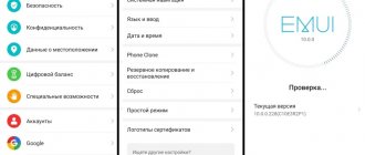
EMUI 10 was released simultaneously with Android 10 - and is intended specifically for smartphones with this operating system. It made its debut in Huawei devices on the Mate 30/Mate 30 Pro model, a full review of which has already been published on 3DNews. Here we will tell you in more detail about this interesting and well-executed shell.
The main difference between EMUI 10 and the previous version (EMUI 9) is a completely redesigned design.
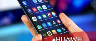
The shell received a new “magazine” design code - many system screens are provided with indents along the edges, like pages of a magazine. The icons have been drawn anew - now they are made exclusively according to the golden ratio. Here we would like to make a note “a perfectionist’s paradise”, but perfect uniformity in the “default” theme cannot be achieved - system icons are invariably square with rounded corners, but some third-party applications are taken into a white square, and some are not for some reason. A new store of themes for the shell can save you, where you can find those that will bring all the icons to a common denominator.
The color code has changed: EMUI 10 uses the colors of the Morandi spectrum - due to this, the shell looks more delicate and fresh. At the same time, EMUI is immediately recognizable to everyone; the differences between the tenth version and the ninth are not noticeable.
The ability to display information on a locked display (Always-On Display) has been on Huawei smartphones for quite some time, but only in EMUI 10 they made a serious emphasis on it - the list of things displayed on the “off” screen has been expanded, fonts can change color depending on the time of day . You can also add small pictures there.
The notification shade has been redrawn - and yes, it has become much better. New icons, new pictograms, even the animation has improved.
The interaction with the icons has changed slightly - now they seem to “press” when touched, as if on a virtual spring, and this really adds tactility to interaction with the smartphone. Gesture control has been improved, its scheme has changed slightly: if you swipe left or right from the corner of the display, you will be sent to the previous screen; swipe up to exit the application; If you pull up from the bottom and hold your finger, a menu opens with all active applications. It is implemented very conveniently - I switched completely to gesture control without a navigation bar at the bottom of the screen without any problems.
Well, the most important visual change is that today’s obligatory dark theme has appeared, which looks great and allows you to significantly save energy on devices with OLED displays. Following the theme of the entire shell, all applications that have this option in their arsenal, like Instagram, also change their color.
Along with all the interfaces, the camera application has also been updated. However, there were no fundamental changes: both the control logic and the set of tools were approximately the same. But the fonts have been replaced - the Leica corporate style has disappeared - the overall style has become visually “lighter”, the icons have been simplified, and in night mode the countdown is carried out in numbers, and not using a descending circle. But the zooming mechanism - with the obligatory need to “pull” the icon, and not change the focal length with one touch on it - has become, on the contrary, more cumbersome.
The response time has decreased, the active use of neural networks also makes EMUI even faster (although no one complained about the smoothness of the system before), allows you to optimize software processes and ensure stable operating speed for a couple of years to come.
The most important internal change in the new shell is related to the introduction of Distributed virtual bus technology, which means that smartphones with EMUI 10 are completely ready to be combined with various devices into a single data exchange system with seamless switching. This is a foundation for the future, in which the proprietary HarmonyOS operating system will already be actively distributed.
Another echo of the same technology is the improved data exchange technology with Huawei OneHop laptops. Now you can not only transfer information in one motion, but also control your smartphone from the laptop screen.
EMUI 10 debuted on the new flagships Huawei Mate 30 and Mate 30 Pro, but an update to the latest version of the shell is planned on a number of the company’s smartphones that have been released for a long time. The following Huawei devices will receive it: Huawei P30 Pro, Huawei P30, Huawei Mate 20, Huawei Mate 20 Pro, Huawei Mate 20 RS, Huawei P30 lite, Huawei P smart 2021, Huawei P smart+ 2021, Huawei P smart Z, Huawei Mate 20 X , Huawei Mate 20 X (5G), Huawei P20 Pro, Huawei P20, Huawei Mate 10 Pro, Huawei Mate 10 Porsche Design, Huawei Mate 10.
Safety
With the advent of fingerprint scanners and the Face Unlock function even in budget smartphones, only the very lazy (and fearless) will use a smartphone without locking. EMUI allows you to further secure some files by moving them to “Personal” in Explorer and blocking the launch of certain applications.
The system file manager allows you to transfer any images, videos, audio recordings and files to “Personal” - they will be stored on the smartphone in encrypted form and can only be accessed by entering a password or scanning your finger in the corresponding section of the application. Application blocking works in a similar way - you can launch the selected program only after entering a code or scanning your finger.
How to customize EMUI 10 interface
One of the advantages of EMUI is undoubtedly its level of customization. Create your own photo as a background, place apps in a dedicated drawer, navigate using physical or virtual keys, rearrange apps on screens - all you need are a few steps to customize the interface to suit your tastes and needs.
- Change background: Settings>Display>Wallpaper>Set wallpaper>Gallery/Other.
- Activate the App Drawer: Settings > Display > Home Screen Style > Drawer.
- Select how to navigate the system: Settings>Smart Assistant>System navigation; Here, you can tell the device to activate a single navigation key to access the home screen, lock screen, and recent activities, whether to activate the virtual navigation bar (by customizing the key combination), or select Quick Menu.
- Change quick settings: Pull down the drop-down menu and tap the pencil icon.
- Change layouts and reorder apps : Long press on the Home screen and tap Settings. In this section, you can reorganize your apps, even shaking your smartphone to rearrange them.
- Show remaining battery percentage : Settings > Apps & notifications > Notifications & status bar > Battery percentage: Do not show / Next to battery icon / Internal battery icon.
- Add contact information to your lock screen : Settings > Security & privacy > Screen lock & passwords > Lock screen signature.
- Disable pedometer on lock screen : Settings > Security & privacy > Screen lock & passwords > Show step counter on lock screen.
New animation
Animation has been significantly updated in EMUI 10. Depending on which interface elements the user clicks on, he receives different visual feedback. For example, when touched, application icons seem to actually press into the screen, creating a naturalistic tapping effect.
In addition, the interface in EMUI 10 has become smoother when scrolling and opening/closing applications due to an increase in the number of animation frames.
Huawei says that it animated different scrolling trajectories based on the laws of physics, determining the optimal speed of movement.
Morandi color palette
When looking for a color palette for EMUI 10, Huawei took as a basis the work of the Italian painter and graphic artist Giorgio Morandi (1890-1964). At first glance, his works use minimalist colors, but in fact their range is quite diverse.
The company tried to transfer all this to its interface, modernizing it based on the latest trends. As a result, some interface elements received a soft color palette. At the same time, they occur pointwise, as separate inclusions in different interface elements, which makes them more noticeable and significant.
New "Dark Mode"
The ability to switch the interface to dark colors appeared in previous versions of EMUI, but then it was one of the battery-saving functions and it only applied to system applications. Now Android 10 itself has a dark theme, so this option has moved to the screen settings.
In addition, when activated, not only the EMUI interface switches to a dark color, but also some Google programs, as well as applications from other developers.
In general, it has become easier to switch to a dark theme; just select the appropriate option in the screen settings and the entire interface, as well as programs, if they support it, switches to it.
In addition, as Huawei notes, they conducted a number of additional studies in which they changed the light intensity of different interface elements in different ambient lighting conditions and at the same time tracked users’ eye movements. This made it possible to better adjust the contrast of text and icons in dark mode to make them more comfortable to read.
Optimizing the battery on a Huawei Honor smartphone
Unfortunately, this doesn't work miracles. You won't be able to last more than two days on your smartphone's battery. However, you can monitor and manage battery consumption with dedicated settings, and if supported, you can take advantage of fast charging to get all the power you need in no time.
- Enable Power Saving Mode: To limit apps running in the background, turn off automatic email and system audio sync.
- Select Over Power Saving Mode: In emergency situations, this mode allows you to use very few apps, which greatly limits the user experience.
- Understand what affects power consumption: Settings > Battery > Battery usage.
- Consumption optimization: Settings > Battery > Optimization, then tap on the tips you want to put into practice.
- Show the remaining charge percentage: Settings > Battery > Battery percentage and select the icon.
- Set a dark interface to save battery power: Settings > Battery > Darken interface colors.
- Use reverse wireless charging: Settings > Battery > Reverse wireless charging.
Flagships VS state employees
99% of the features described above are available on all Huawei smartphones from the most affordable Y5 (2018) to the P and Mate series, but flagships offer even more. For example, devices with Kirin 970 (Mate 10, P20 Pro and P20) support desktop mode, when using a Type-C-HDMI adapter a “computer” interface is displayed on the external screen, in which you can run mobile applications in separate windows and thus assemble kind of like a mobile office.
Some functions are tailored to the NPU built into the processor - this is the Microsoft Translator, product recognition from photos with integration from Amazon, accessible from the system search, business card scanning for more convenient adding of new contacts, and more.
